Beyond a Brochure Website. A User Experience. Marin Airporter’s New Site Illustrates.
If you live in Marin County, CA (just North of San Francisco) chances are you’ve used Marin Airporter to get you to or from the San Francisco International Airport (SFO). This comfortable bus service has been around for decades and offers a reliable and relaxing way to start and end a trip. For ComBridges, of course, Marin Airporter also is a nice high-visibility new client.
Their old website, on the other hand, was not so easy to use. Rather than making things easier for the steady stream of customers who use the service, their website presented challenges.
 For starters, there had been changes to some of the stops, parking at those stops, and more. But more importantly, there was nothing mobile-friendly about their old website. In addition to a non-responsive design, the bus schedule, for example, was displayed only as one big PDF.
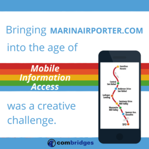
So, even more than a graphic design assignment, bringing MarinAirporter.com into the age of mobile information access was a creative challenge in information architecture. The fundamental requirement was to improve the user experience in a major way.
And, to make matters even more interesting, after being a “cash-only” service for many years, the launch of this new website also included the introduction of electronic ticketing.
Honestly, this is the kind of challenge that I truly enjoy.
How Did the New Website Design Address These Challenges?
Of course, the low-hanging fruit was to integrate everything on their website into a 100% responsive, mobile-friendly design.
Then, instead of the old “one-page-fits-all” PDF schedule (which is still available for those who prefer that sort of thing) each stop now has its own page of information that is easy to access via a simple click on a user-friendly route map graphic (with an “alternate route” to each bus stops page also available via links on the main navigation menu). Because each stop’s information is now provided on a stop-by-stop basis, it’s easy to find just the right information you need for your trip without your having to wade into the weeds of data about the other six stops.
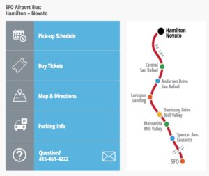
The web page for each stop has a convenient accordion-style menu which opens when clicked.
Then, each of Marin Airporter’s new bus stop web pages gives you quick access to specific chunks of stop-specific information that was either difficult to find or unavailable on our old site. Once you arrive at the page for the stop that’s most convenient for you, a list of big blue buttons offers you the following choices:
- Pick Up Schedule
- Buy Tickets
- Map and Directions
- Parking Info
- Questions
Everything you need to know. How early? Departing how often? When? How long to the airport? Done and done.
The Map and Directions tab is great for travelers not familiar with Marin, and for those of us who get confused from time to time or need to use a different stop (because maybe we’re taking the new SMART train to Central San Rafael for the first time). The text directions from all points are accompanied by a detailed bird’s-eye view of the area.
When a Website is More than a Brochure
Obviously, there are many, many different kinds of websites. I’ve been doing simpler website designs—often in collaborative done-with-you “1-to-1 Get-It-Done” sessions—using Squarespace. For more sophisticated sites with more complex and custom requirements like this one, I often use WordPress. MarinAirporter.com is a highly-customized WordPress implementation.
My delight as a creative director and digital marketing strategist is helping organizations, large and small, to clarify their communication and user experience objectives so that we can meet those goals effectively.
Please contact me if you have questions or if we can help in any way.


